 01
Pilgrim
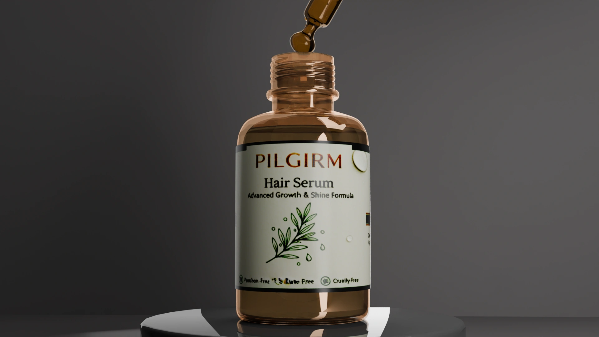
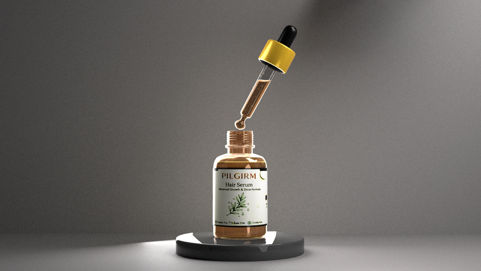
The initial identity explored an earthy visual language with heavier typography and a handcrafted aesthetic.
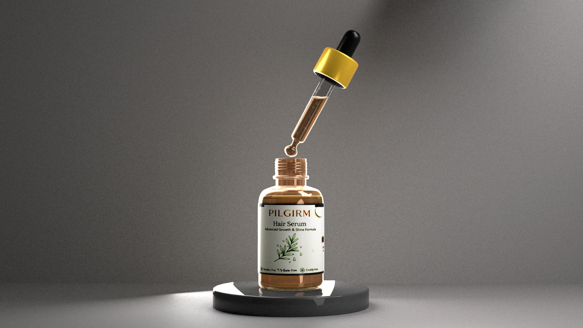
An exploration of luxury cosmetic rendering through physically based materials, cinematic studio lighting and refined product composition.
“Luxury is perceived through light before it is recognized through form.”
Luminance
Product Visualization
3D Artist
1 Week
Permanent Collection
Luminance is a premium cosmetic product visualization study focused on the interaction between glass, liquid, metallic finishes, and controlled studio lighting. Every render was developed to explore how subtle material behaviour and composition influence the perception of luxury packaging.
Premium cosmetic products rely almost entirely on material quality and lighting to communicate value. Glass, transparent liquids, metallic finishes and printed labels all react differently under studio illumination, making visual consistency difficult to achieve.
The project was developed through multiple iterations of lighting, composition and material refinement. Each render evaluated transparency, reflections, liquid appearance and label readability until the product communicated a clean luxury aesthetic.
The bottle, dropper and packaging were refined through multiple iterations before establishing the final visual language.
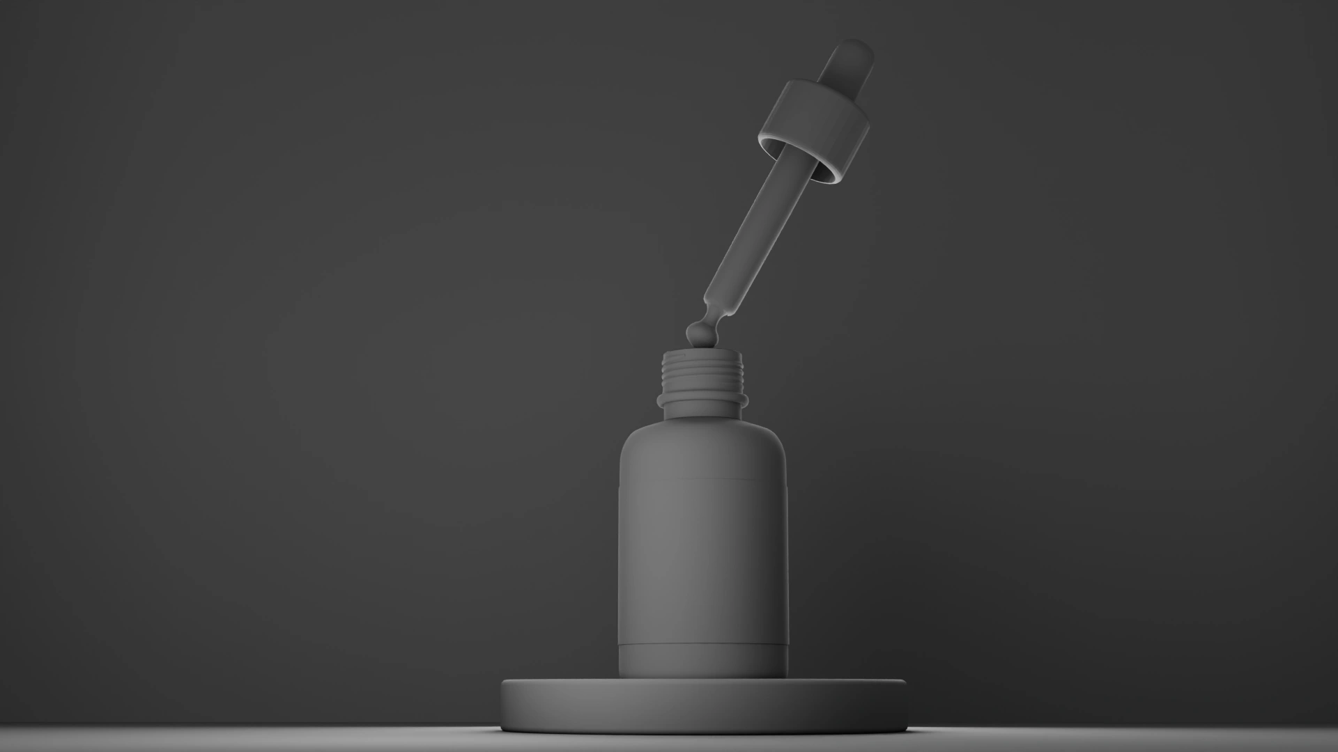
Evaluating proportions and silhouette without material influence.
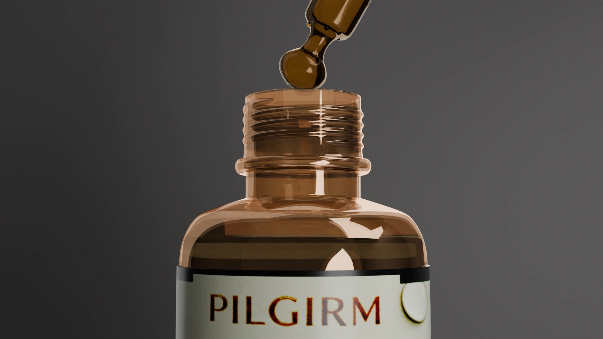
Amber glass refined through transmission and roughness studies.
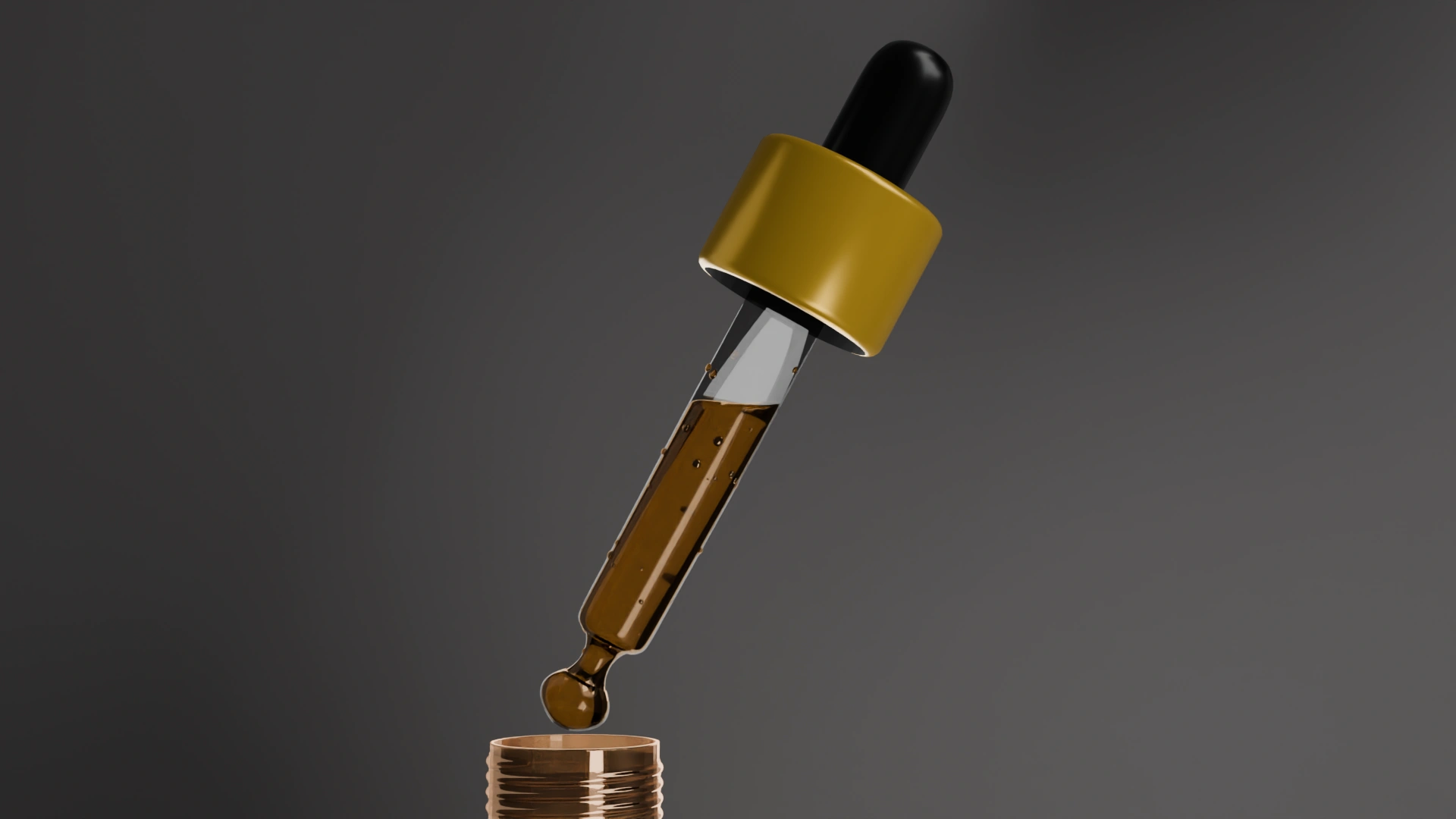
Liquid colour and transparency adjusted for believable depth.
Minimal branding focused on readability and premium aesthetics.
Multiple branding concepts were explored before arriving at the final visual language. Each iteration refined the relationship between typography, packaging and material presentation.
01The initial identity explored an earthy visual language with heavier typography and a handcrafted aesthetic.
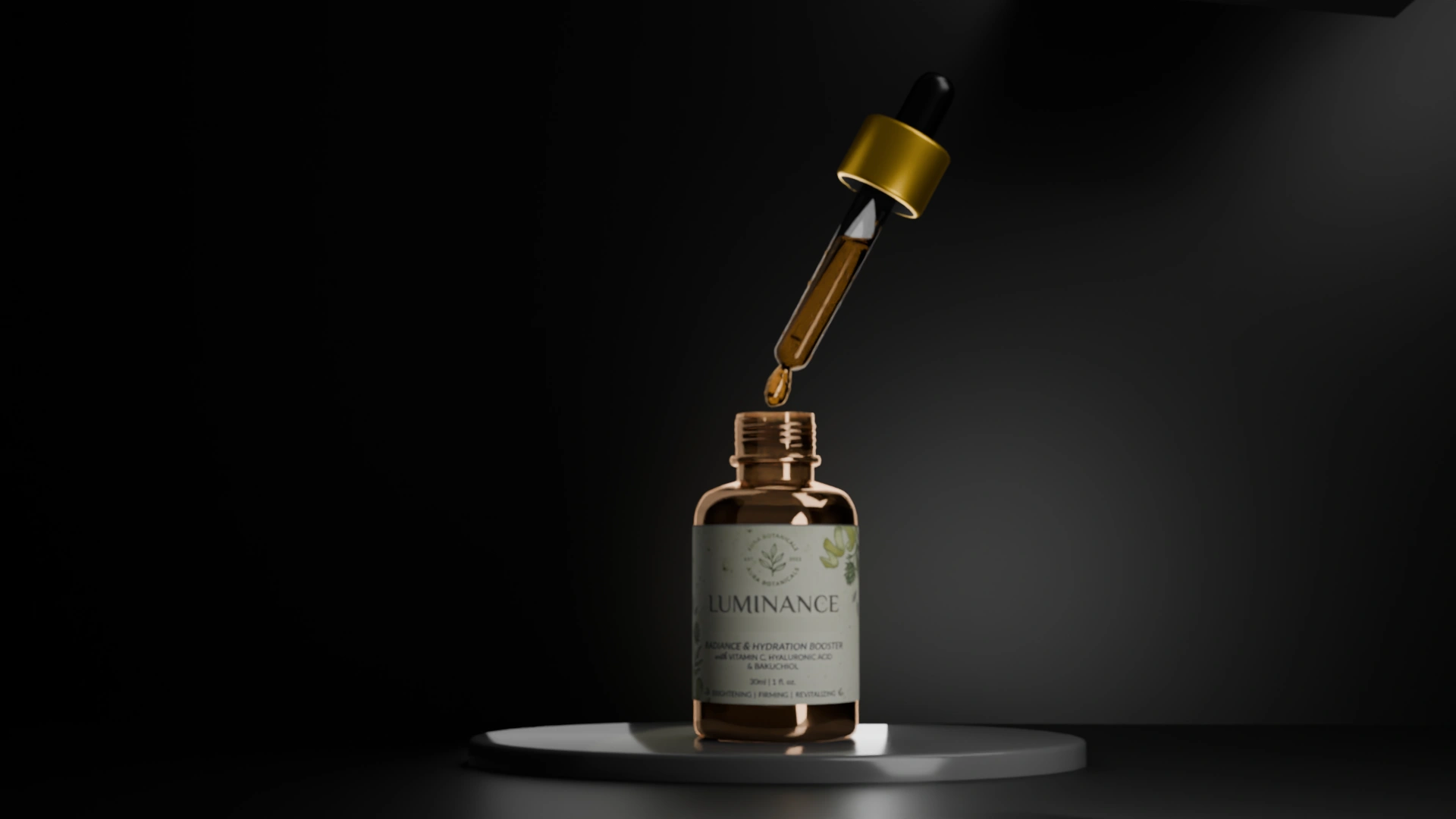 02
The branding shifted toward cleaner typography and restrained colour, improving readability and premium perception.
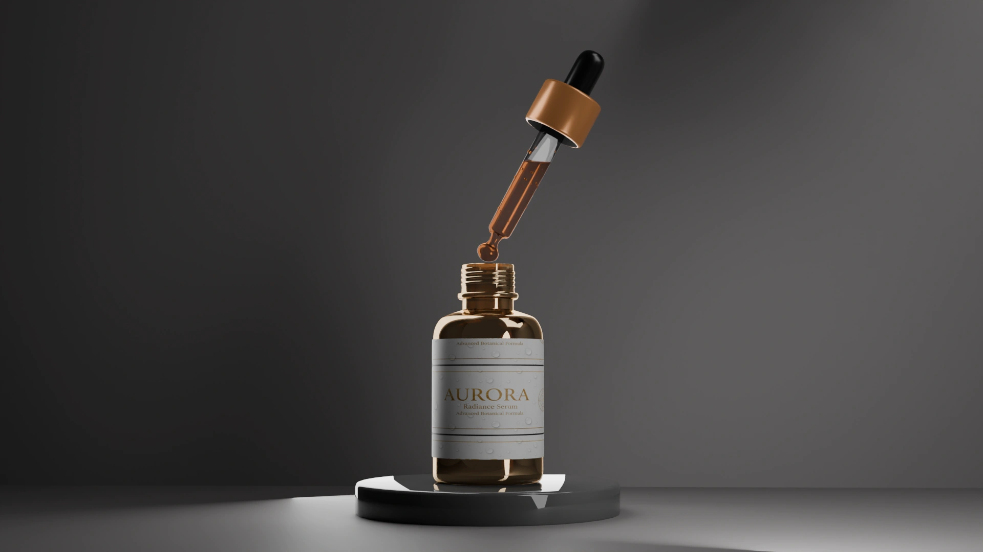 03
The final direction balances minimal packaging with refined materials, allowing lighting and glass to become the primary visual focus.
Branding should support the product, not compete with it.
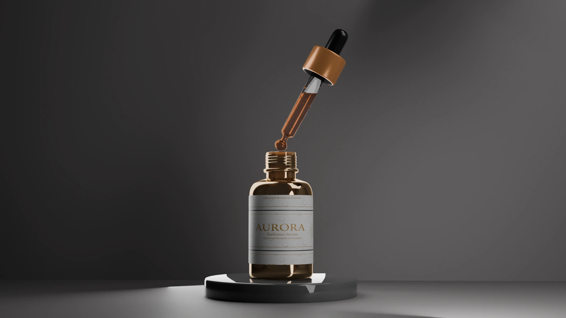
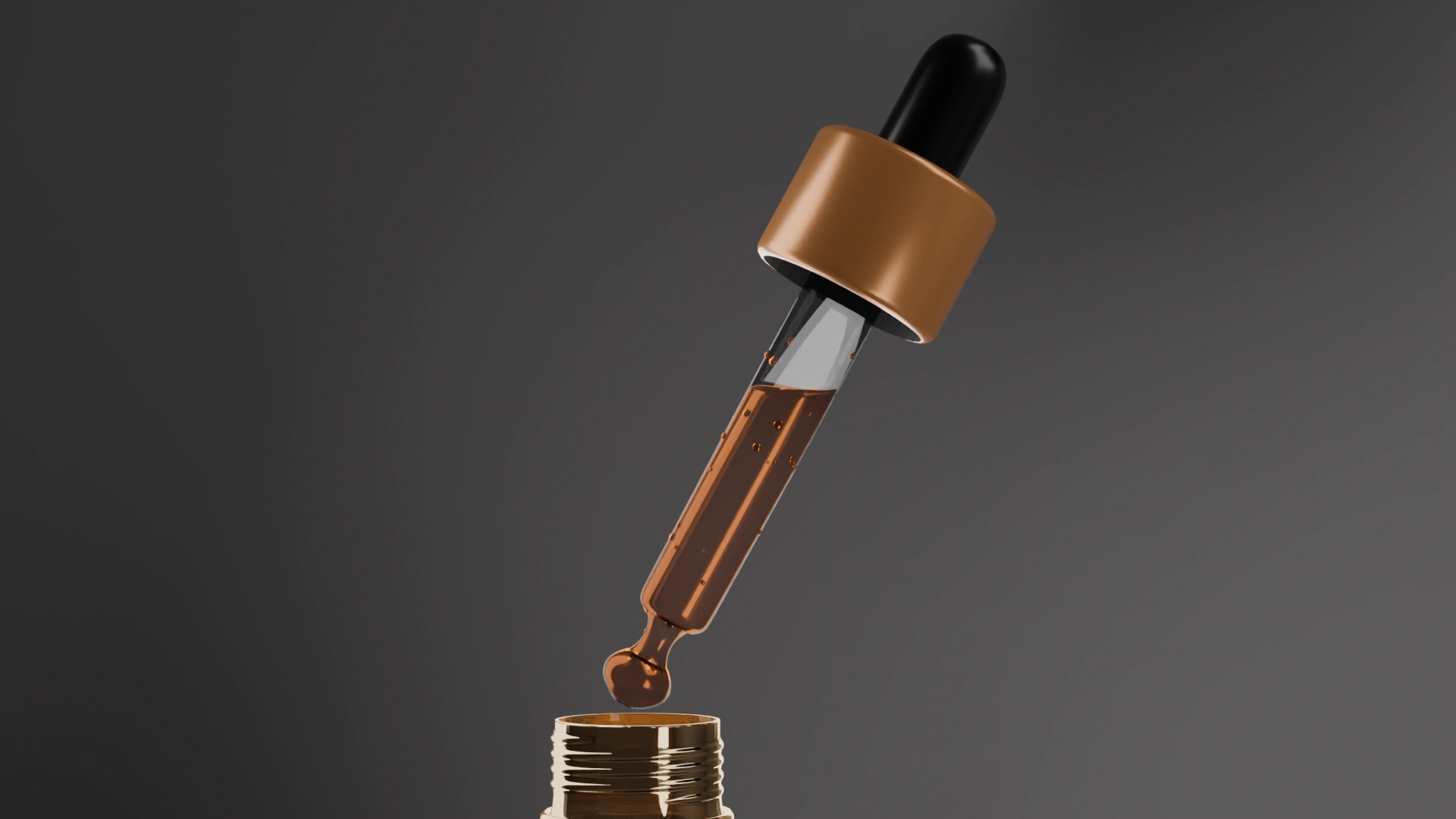
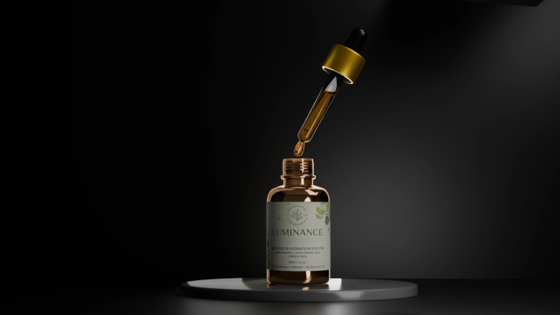
Lighting was refined through multiple iterations before reaching the final composition.
 01
Established the initial lighting direction and evaluated overall readability.
 02
Soft area lighting improved material separation while preserving subtle reflections.
 03
Increasing directional contrast strengthened depth and visual hierarchy.
 04
Background tone and light intensity were refined to create a calmer premium mood.
 05
The final setup balanced clarity, warmth and controlled reflections for commercial presentation.
Light doesn't reveal the product. It defines it.
Different camera positions were explored to evaluate how scale, focus and framing influence the perception of a premium cosmetic product.
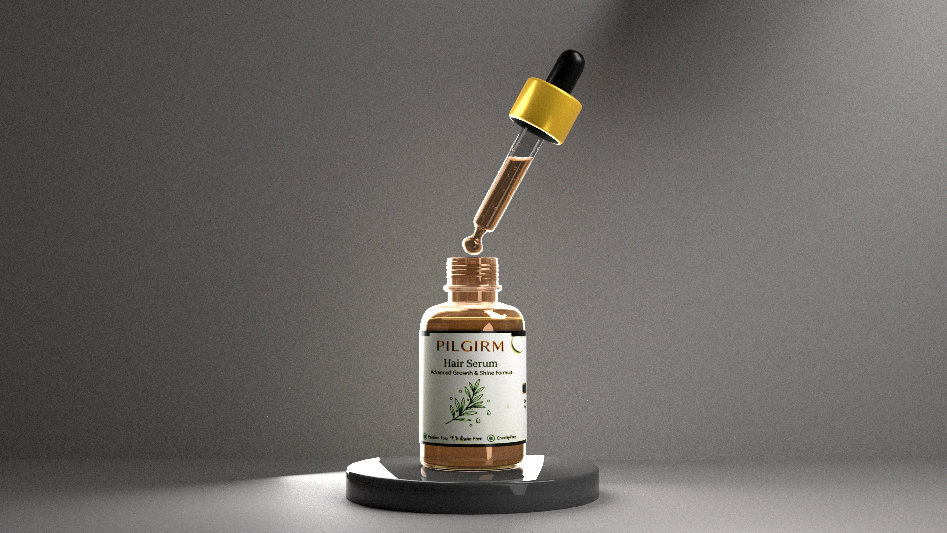
Introduces the complete product while establishing balance and negative space.
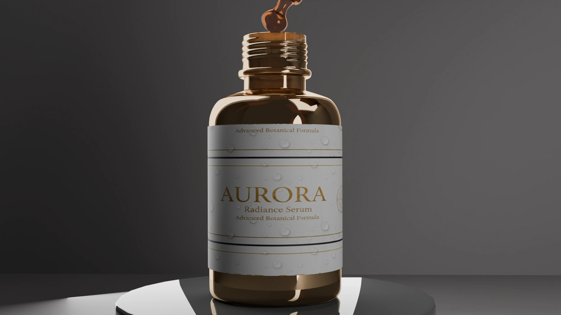
A tighter crop shifts attention toward material transitions and label hierarchy.
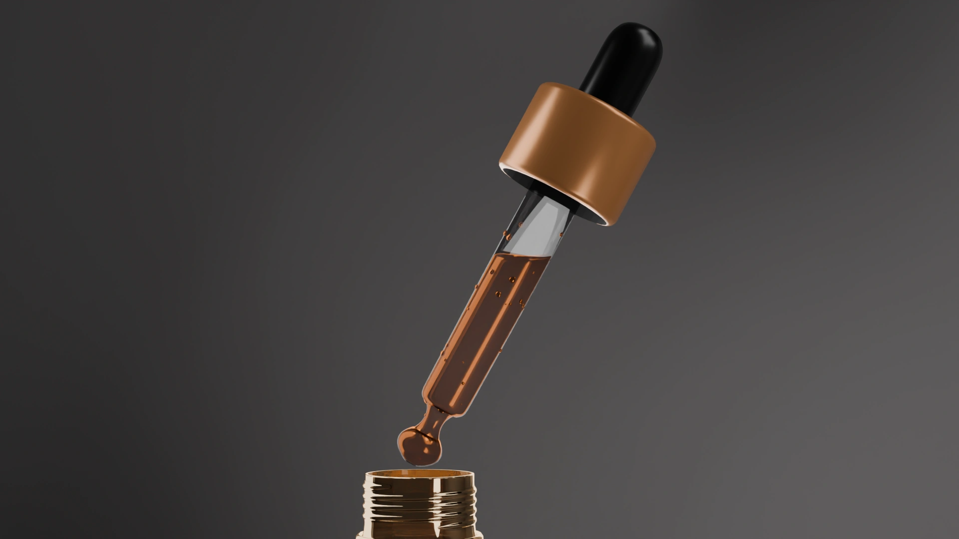
Macro framing emphasizes glass thickness, liquid clarity and precision.

The smallest details become the visual subject, highlighting craftsmanship and realism.
The camera determines what deserves attention.
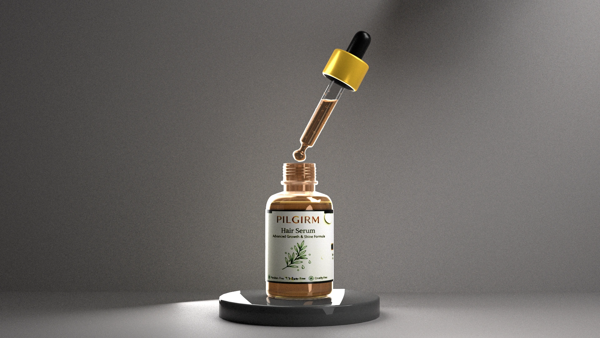
The final presentation brings together the outcomes of every lighting, branding and composition study into a single commercial visualization.
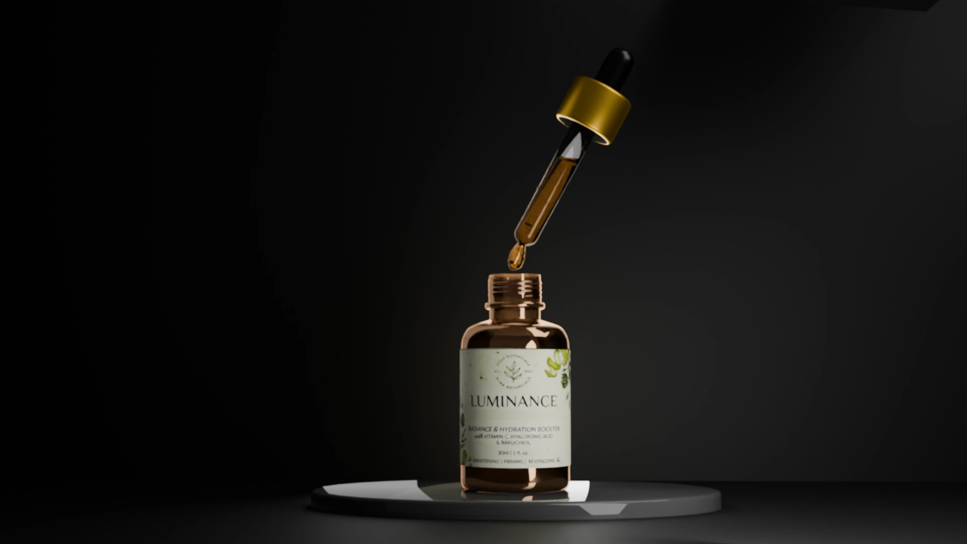
Luminance demonstrated that successful product visualization depends less on geometric complexity and more on the relationship between lighting, material behaviour and composition. Every refinement moved the project closer to communicating quality through subtle visual decisions rather than technical excess.
Lighting Research
Akira
2025
Blender • Cycles
ARCHIVED
"Light reveals structure."